Part of a Series of Tutorials on using Google Sheets
Last updated: October 12, 2017
Case Data versus Summary Data
Data sets on the Web may contain thousands or millions of rows of data. Each row of data can be considered a single instance of an event or entry about a specific entity (e.g. person, country, food product, or date), and each column of data has the same type of information about each instance of data (e.g. for people, the columns might be age, height, weight, hair color etc.). The rows are called cases and the columns are called variables. The different entries for each column of data may be constrained to a limited set of options to choose from (e.g. for a column named hair color, the options may be limited to black, brown, red, blonde for natural hair colors) and these can be considered categories.
Sometimes we’re interested in information about the relative number of cases in each category, and when this is analyzed, it is often referred to as “summary data.”
From Categories into Distributions
One way to make meaning from a dataset is by making a graph that shows the number of cases into categories – that is, what proportion or percentage of the cases fall into each of a small number of categories, such as gender, income groups or marital status. When you have an overview of this information, it’s called a distribution. This tutorial will show you how to use Google Sheets to figure out the numbers for the distribution you are interested in, then use the results to create pie graphs and bar graphs in an infographic canvas tool.
Getting the Sample Data
We’re going to use, as our example, the National Health and Nutritional Examination Survey (NHANES) dataset. In the NHANES dataset, there are several thousand cases, each of which has data about a single person. NHANES data are highly encoded with numbers or abbreviations that stand in for readable words, and also come with a lot of metadata (data about data). These two factors make their datasets confusing for the general public. However, there is a useful data exploration interface for NHANES, which has been developed by Tim Erickson, a freelance science and math educator. The data have already been downloaded from NHANES and reformatted to be easily accessible.
Go to the EEPS NHANES data exploration system web page: http://www.eeps.com/zoo/nhanes/source/choose.php. There you will find a webform where you can select the variables you want to examine, including demographics, body measurements, and biochemistry bloodwork information. Where applicable, the units are next to each variable. For example, “Age” is in years, “Weight” is in kilograms, and “Height” is in centimeters.

For this tutorial, check the box for H_Income (Household Income) in the Demography section and keep the default variables already marked. In this interface you are required to look at a preview of your data before you get a large sample, so click on the button “Preview the Data” at the top. The data exploration system will load a table with a handful of sample cases in the web page.

If the data are what you expected, enter 2000 in the “Sample size” text box and click on “Get entire sample”. We chose a sample of 2000 to demonstrate how Google Sheets can help you deal with a large amount of data easily. The interface will give you 2000 cases, as requested.

Select all the contents of the table, then copy and paste the data into a new Google Sheet file. It should paste correctly into each spreadsheet cell. If it doesn’t, make sure you have selected only the contents of the table. If you select any text before the table, after the table or in the side panel, everything will get pasted into a single cell; this is a common error. Now that our data are in Google Sheets, we are ready for analysis.
Reading the Data
Starting off, take a look at what’s going on here. In this dataset sample, we have Sex, Age, Race, Education, Household Income, Marital Status, Weight (kg), Height (cm), and BMI (body mass index, a measure of body fat based on height and weight). (The kg and cm labels come from the EEPS NHANES web page where we requested the data.) Age, Weight, Height, and BMI have numerical values. Sex, Race, Education, Household Income, and Marital Status have text values with limited options, as listed below.
| Column | Possible Text Values |
| Sex | Male, Female |
| Race | Black, White, Mexican American, Other Hispanic, and Other including multi |
| Education | More than HS, Less than HS, HS incl GED, blank |
| H_Income | $0-5 K, $5-10 K, $10-15 K, $15-20 K, $20-25 K, $25-$35 K, $35-45 K, $45-55 K, $55-65 K, $65-75 K, $75+ K |
| Marital Status | Never Married, Married, Divorced, Widowed, Separated, Living with Partner, blank |
Some of the things we might notice about the data are:
- The values for Household Income look like numerical values, but they are actually categories, each of which indicates a range of incomes.
- Education is generally blank for young children who are not old enough to have entered school yet.
- Marital Status is blank for people 13 years of age and under.
- Values for Height and Weight have decimals.
We’ll now look at two different ways to explore the distribution of Race in our sample. We’ll use Google Sheets to generate the data, then create both a pie chart and a bar graph in your infographic creation tool of choice. You can paste these into your infographic canvas tool, but if you wanted to create something like it directly in the tool so that you have more control over design and aesthetics, you can follow a procedure something like the following. The basic idea is to grab the summary data from the graphs in Google Sheets, organize them in a separate Google Sheet worksheet, and use the organized data in an infographic canvas tool to create a pie graph and a bar graph.
Analyzing the Data for the Distribution of Race
For this tutorial, we will only look at the Race column. First, select the entire Race column by clicking on the letter above the column. With it selected, go to Insert->Chart. It will automatically insert a bar chart. Hover over the bars and you will see the number of people in each bar for each race.
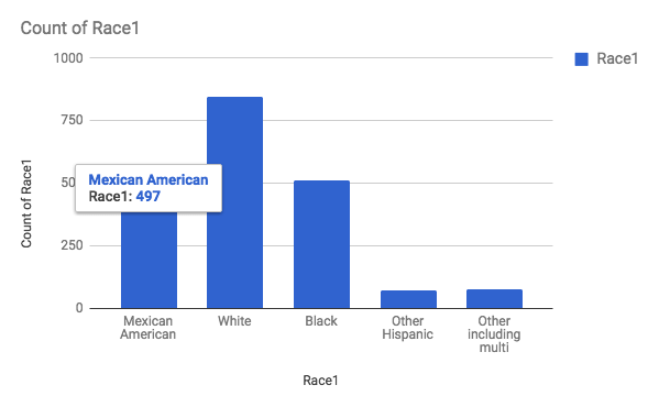
Create a new worksheet in your Google Sheet for these numbers. Make sure to put in a header row to describe the data underneath. In column A, put “Race” in cell A1, and list out the different races below. In column B, put “Count” in B1, and copy the numbers for each race from the bar graph you made in Sheets. You may want to sort the rows so that the count numbers are in decreasing order. This looks better when making pie graphs, but be careful it may give people the wrong idea about the data having a “downward trend” in a bar graph.

Watch out: don’t use a line graph for this kind of data because the different races are discrete categories, not a continuous interval or time span.
Recreating the Graph in an Infographic Canvas Tool
You can copy over the data into the tool’s data table, and depending on the tool and the type of graph, you may have to leave out the header row. For example, in Venngage, the pie graph data entry area does not have a header row. (The sample summary data below was taken from a different sub-sample of the NHANES data set, so the numbers are different.)

But in Venngage’s vertical bar graph, it does have a header row.

Reflecting on the Data
Now that you’ve completed this walkthrough, here are some key points to take away:
- Most of the population in this dataset identifies as White.
- Considering the limited number of options for Race entry, the place(s) where this data was collected is not racially diverse.
- Could there have been people who did not want to identify their race? Adding up the total number of people, the sum is 2000, so it means that everyone in this dataset have been identified in the race category.
You must be logged in to post a comment.