Part of a Series of Tutorials on using Google Sheets
Last updated: October 12, 2017
Scatter Plots
One way to investigate whether two variables are related to one another is to create a scatterplot, which plots one variable on the X-axis and one on the Y-axis, and shows you how they may be related.
Getting the Sample Data
We’re going to use, as our example, the National Health and Nutritional Examination Survey (NHANES) dataset. In the NHANES dataset, there are several thousand cases, each of which has data about a single person. NHANES data are highly encoded with numbers or abbreviations that stand in for readable words, and also come with a lot of metadata (data about data). These two factors make their datasets confusing for the general public. However, there is a useful data exploration interface for NHANES, which has been developed by Tim Erickson, a freelance science and math educator. The data have already been downloaded from NHANES and reformatted to be easily accessible.
Go to the EEPS NHANES data exploration system web page: http://www.eeps.com/zoo/nhanes/source/choose.php. There you will find a webform where you can select the variables you want to examine, including demographics, body measurements, and biochemistry bloodwork information. Where applicable, the units are next to each variable. For example, “Age” is in years, “Weight” is in kilograms, and “Height” is in centimeters.
 For this tutorial, check the box for H_Income (Household Income) in the Demography section and keep the default variables already marked. In this interface you are required to look at a preview of your data before you get a large sample, so click on the button “Preview the Data” at the top. The data exploration system will load a table with a handful of sample cases in the web page.

If the data are what you expected, enter 2000 in the “Sample size” text box and click on “Get entire sample”. We chose a sample of 2000 to demonstrate how Google Sheets can help you deal with a large amount of data easily. The interface will give you 2000 cases, as requested.

Select all the contents of the table, then copy and paste the data into a new Google Sheet file. It should paste correctly into each spreadsheet cell. If it doesn’t, make sure you have selected only the contents of the table. If you select any text before the table, after the table or in the side panel, everything will get pasted into a single cell; this is a common error. Now that our data are in Google Sheets, we are ready for analysis.
Reading the Data
Starting off, take a look at what’s going on here. In this dataset sample, we have Sex, Age, Race, Education, Household Income, Marital Status, Weight (kg), Height (cm), and BMI (body mass index, a measure of body fat based on height and weight). (The kg and cm labels come from the EEPS NHANES web page where we requested the data.) Age, Weight, Height, and BMI have numerical values. Sex, Race, Education, Household Income, and Marital Status have text values with limited options, as listed below.
| Column | Possible Text Values |
| Sex | Male, Female |
| Race | Black, White, Mexican American, Other Hispanic, and Other including multi |
| Education | More than HS, Less than HS, HS incl GED, blank |
| H_Income | $0-5 K, $5-10 K, $10-15 K, $15-20 K, $20-25 K, $25-$35 K, $35-45 K, $45-55 K, $55-65 K, $65-75 K, $75+ K |
| Marital Status | Never Married, Married, Divorced, Widowed, Separated, Living with Partner, blank |
Some of the things we might notice about the data are:
- The values for Household Income look like numerical values, but they are actually categories, each of which indicates a range of incomes.
Education is generally blank for young children who are not old enough to have entered school yet. - Marital Status is blank for people 13 years of age and under.
- Values for Height and Weight have decimals.
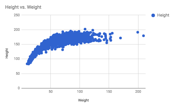
- Two variables that we can easily imagine might have a relationship to one another are height and weight; we might expect that taller people are also heavier. We will create a scatterplot to see if this is the case.
- Creating a Scatterplot in Google Sheets
Click and drag over the column letters for Weight and Height to select them. (They should be next to each other because that’s how we requested the data.) Then go to the the menu Insert->Chart… and it will automatically recognize that the data in the columns are decimal numbers and create a scatter plot with an appropriate chart title and labeled axes.
Creating a Scatter Plot in an Infographic Canvas Tool
Find the scatter plot option if it is available. In most tools, you will need to place the sample scatter plot on the canvas first. Go into the edit data view for the scatter plot. Getting to the edit data view will be different from one infographic canvas tool to the next. Our x-axis will be Weight, and our y-axis will be Height. In Google Sheets, select all the data in the column for Weight, not including the label on the first row. Paste this into the data table, starting at cell A2, leaving row 1 for the label if the canvas tool asks for it. Copy and paste the Height data into column B, starting at cell B2. In Venngage, our scatter plot will look something like this:

It’s hard to read the graph without knowing what each axis represents, so make sure you label the axes. For the x-axis Title, type in “Weight in kg.” Notice that it’s not just “Weight” because that doesn’t convey the units to the reader. Do the same with the y-axis and label it “Height in cm.” If you don’t remember the units, you can recheck on the data source. The kg and cm come from the EEPS NHANES data exploration tool web page.

Reflecting on the Data
Now that you’ve completed this walkthrough, here are some key points to take away:
- Weight and height increase together but there’s a curve so it’s not a linear relationship.
- There’s a data point that has a height of about 150 cm but a weight of 0 kg. This means there’s missing data for that person.
You must be logged in to post a comment.